Making the most of wallpaper
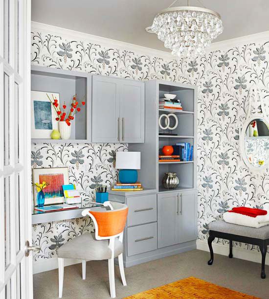
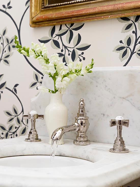
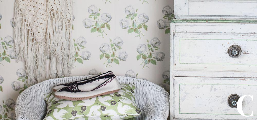
The colour you paint a room has a dramatic impact on the appearance of size, light and warmth in the space. Of course, for the most bold impact, wallpaper is our favourite choice, and printing techniques these days mean you can have almost any pattern or picture you can dream of.
We have consolidated some advice below for choosing wallpaper from one of our favourite home magazines, Better Homes & Gardens: https://www.bhg.com/
Take a Cue from Color Color can set the mood in a room. To make a space appear larger and the ceiling higher, pick patterns with cool-color backgrounds, such as green, blue, or violet. Soft cool colors suggest tranquillity, while intense cool colors are fresh and dramatic. Warm colors — reds, yellows, and oranges — live up to their name and actually make people feel warmer. These are a popular choice in colder climates and also work well in south-facing rooms. The more intense the color, the more excitement it will give to a room.
Play with Light In a north-facing room, dark hallway, or windowless space, look for wallcoverings that will reflect light around the room, such as patterns with light colors and those with metallic or iridescent inks. Also consider patterns with smooth surfaces, which reflect maximum light. Textured surfaces also tend to make a wall look darker.
Hide Flaws with Texture Patterns with real or perceived texture can hide or camouflage wall imperfections or architectural eyesores. Patterns with actual tactile surfaces include grass and string cloth, burlap, foil, expanded vinyl, and even fabric. Other papers simulate the look of marble, wood, leather, fabric, even animal skins. A pattern with a layered design also creates a perception of texture (such as a monochromatic damask design behind a floral pattern).

Consider how the room is used, and how often, when choosing wallpaper patterns.
Choose a Suitable Style For a formal look, choose large-scale patterns with dramatic colors. For a fun, bright style, pick small motifs that are open and regularly spaced, such as polka dots.
Accent the Positive Stripes and other vertical patterns, which emphasize height, suggest dignity, vitality, and formality. Vertical patterns, including florals where the motif’s shape suggests a V or a U, will make a ceiling appear higher. Horizontal patterns accent width, suggest quietness and repose, and make narrow rooms appear wider.
Scale for Success Small-scale patterns create a feel of spaciousness, while large-scale designs make rooms more intimate. To make an empty room look more furnished, pick large-scale patterns with bright colors and dark backgrounds. To give flat walls the look of depth, try a large, open dimensional pattern, such as a trellis design.
Mix and Match Wisely A room without pattern can bore, while a room with too many patterns can cause restlessness. When mixing stripes, florals, or plaids in a room or between adjacent areas, pick patterns that repeat the same color or values of that color. Wallcovering books usually group designs by color to make coordinating easy.


